Military Sexual Trauma Recovery Coach App
Problem Defined
1 in every 4 women and 1 in 100 men seen in VA (Department of Vateran Affairs) report to have experienced military sexual trauma. For some Veterans, the experience of MST may continue to affect their mental and physical health in significant ways, even many years later.
MST survivors are commonly concerned about self perceived stigma, distress when encountering “triggers” or trauma reminders, loneliness, isolation, and privacy issues. They need to know about VA treatment resources and feel a greater sense of safety and control. For many of them, the app could be their first step to VA care. For some of them, there are logistic barriers to VA care such as employment and transportation.
Project Goal
To address these challenges, this app will create a non-demanding therapeutic experience that can overcome logistic barriers, help reduce perceived stigma, teach and encourage the use of symptom reduction and distress tolerance skills, allow easy symptom self-monitoring, and increase the likelihood of connecting with more traditional mental health care.
My Role
As the lead UX architect of the project, I led all the meetings with clients to understand project objectives and goals and discuss design concepts. Together with two other designers on the team, we researched numerous health and well being related apps on the market, trying to find engaging and innovative ways to help military sexual trauma survivors. We iterated through hundreds of concepts and came up with a balanced yet novel approach in solving MST survivors’ problems
Skill/Tool Used
- UX Strategy
- UX Discovery
- Leadership
- Client Management
- Design Studio Facilitation
- Usability Testing
- Wireframing
- Sketch
- Craft
- Invision
Discovery
In the kick-off meeting, several mental health experts and clinical psychologist from VA introduced us to the world of military sexual trauma survivors. We were shocked to find how prevalent this is in the military and how small a percentage of the sexual assault cases actually got prosecuted. After reviewing material related to MST, we learnt that it’s common for MST survivors to feel:
- Stigma/shame/self-blame
- Distress when encountering “triggers” or trauma reminders
- Loneliness/isolation
- Concerns about privacy
- Need knowledge about VA treatment resources
- Need for greater sense of safety and control
We also learnt many MST survivors are either living in remote areas or deployed around the world where they do not have access to professional mental health care. There is also a huge mental barrier of not wanting to seek help because of shame and self blame, especially for male MST survivors. For them, masculinity worries, sexual concerns and relationship problems are top on their concern list.
We also did research on e-health related topics to understand how people manage their health using mobile technologies. We also found papers published by VA research team on the reach and usage of their PTSD app and derived valuable insights from the data they collected.
After the initial understanding phase of our discovery, we started to think of solutions to create an engaging and dynamic experience for MST survivors. I led three rounds of design studio workshops where we first identified the focus we want to work on, and then brainstormed ideas by doing hand sketches of many different directions. We then converged and synthesized into three distinct concepts.
For a more detailed description of design studio process we used, read this post.
Concept Exploration
Hand sketch Concepts
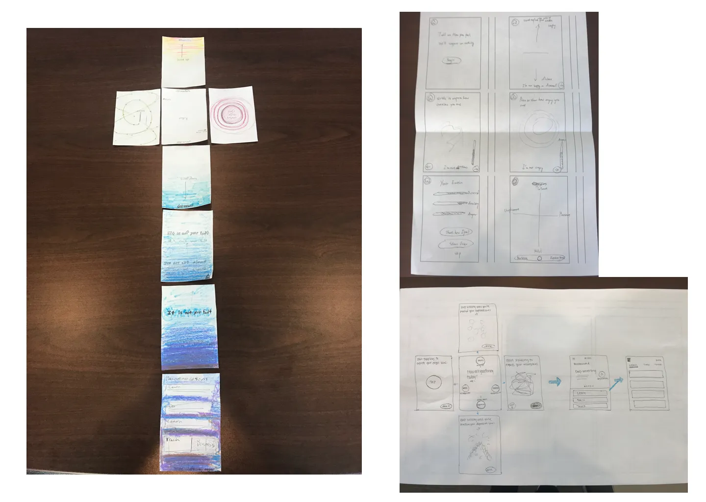
User express their mood(depressed, anxious, anger) through scrolling, scribbling and long press.
First Iteration
After internal review with development and technical lead, we narrowed down our concepts to three distinct ones. I led several rounds of design studio sessions and came up with three distinct design concepts that address user needs in different ways but all aim to guide users through their recovery journey in a warm and personal way.
Concept 1: Companion
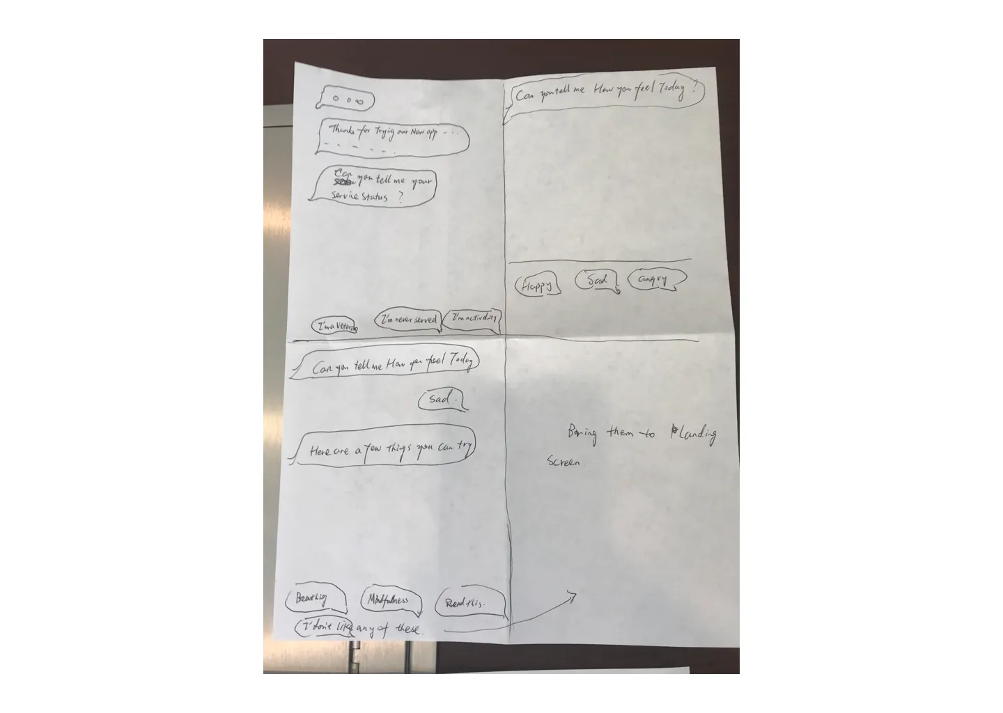
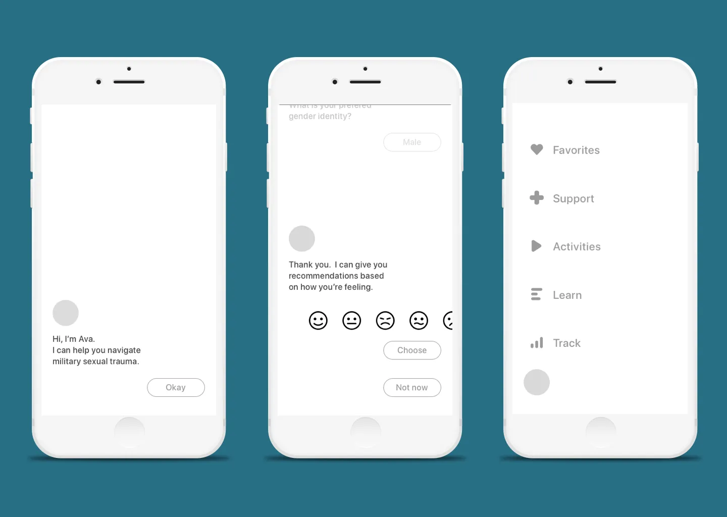
- A conversational interface Ava(Assistant VA) will be your companion in your recovery from MST. Ava is patient, compassionate, and knowledgeable. Conversational interface through out onboarding and emotion capturing. Lead user through the journey by asking questions and providing relevant content. Minimum navigation or decision making on user’s part.
Conversational Interface
Concept 2: Mosaic
- A concept developed from this video.
- Making mosaics can be a form of art therapy and meditation. It is creating beauty from broken pieces, which is like a symbol of healing.
- This concept would create an interactive therapeutic experience for the users.
- User’s emotion/symptoms are represented by individual mosaic pieces.
- Users choose their concern and complete 4 short activities that help relieve their concerns. This process allows the users to “piece together” their negative emotion by doing activities that help relieve their concerns.
Mosaic Concept
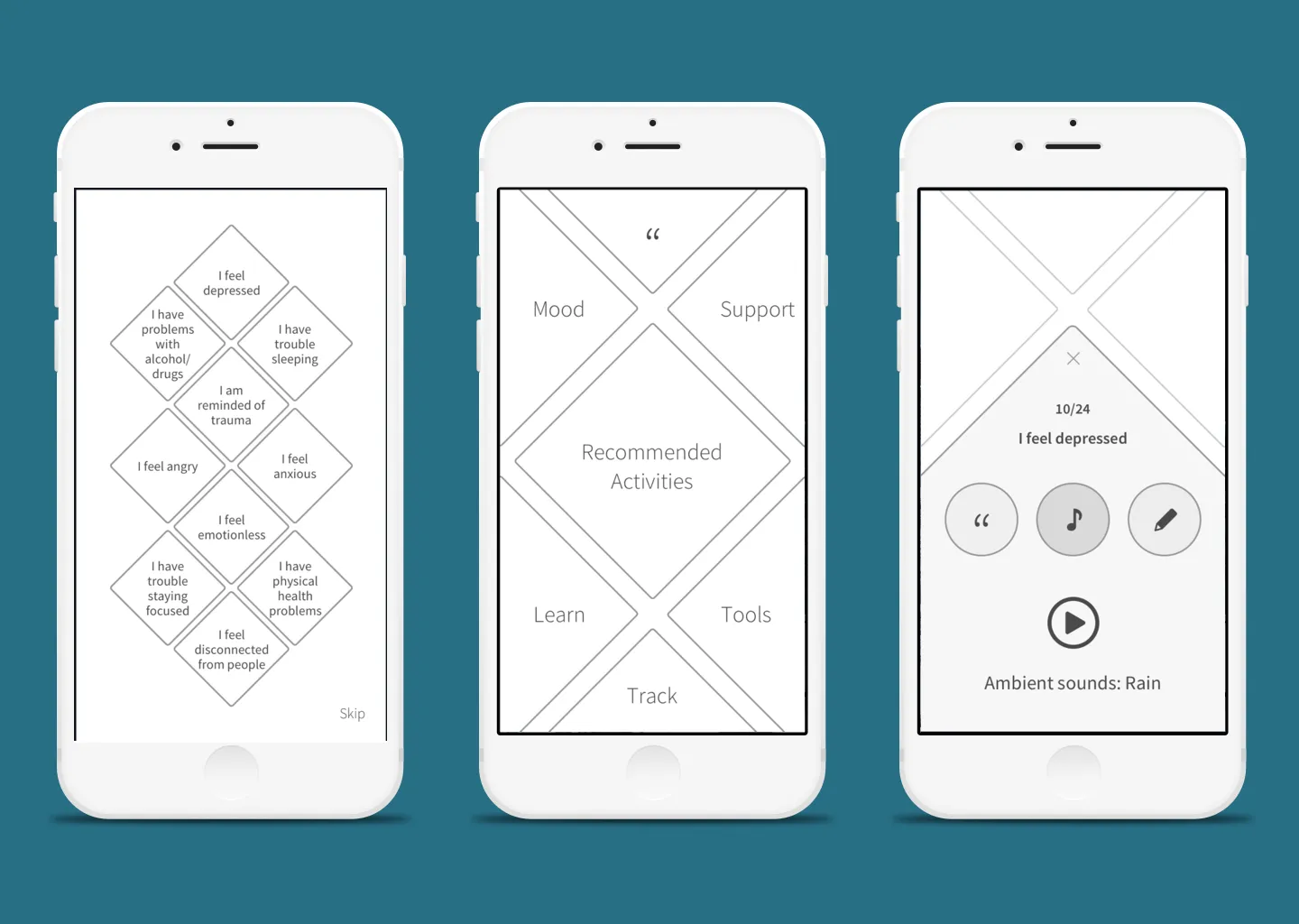
Concept 3: Emotion
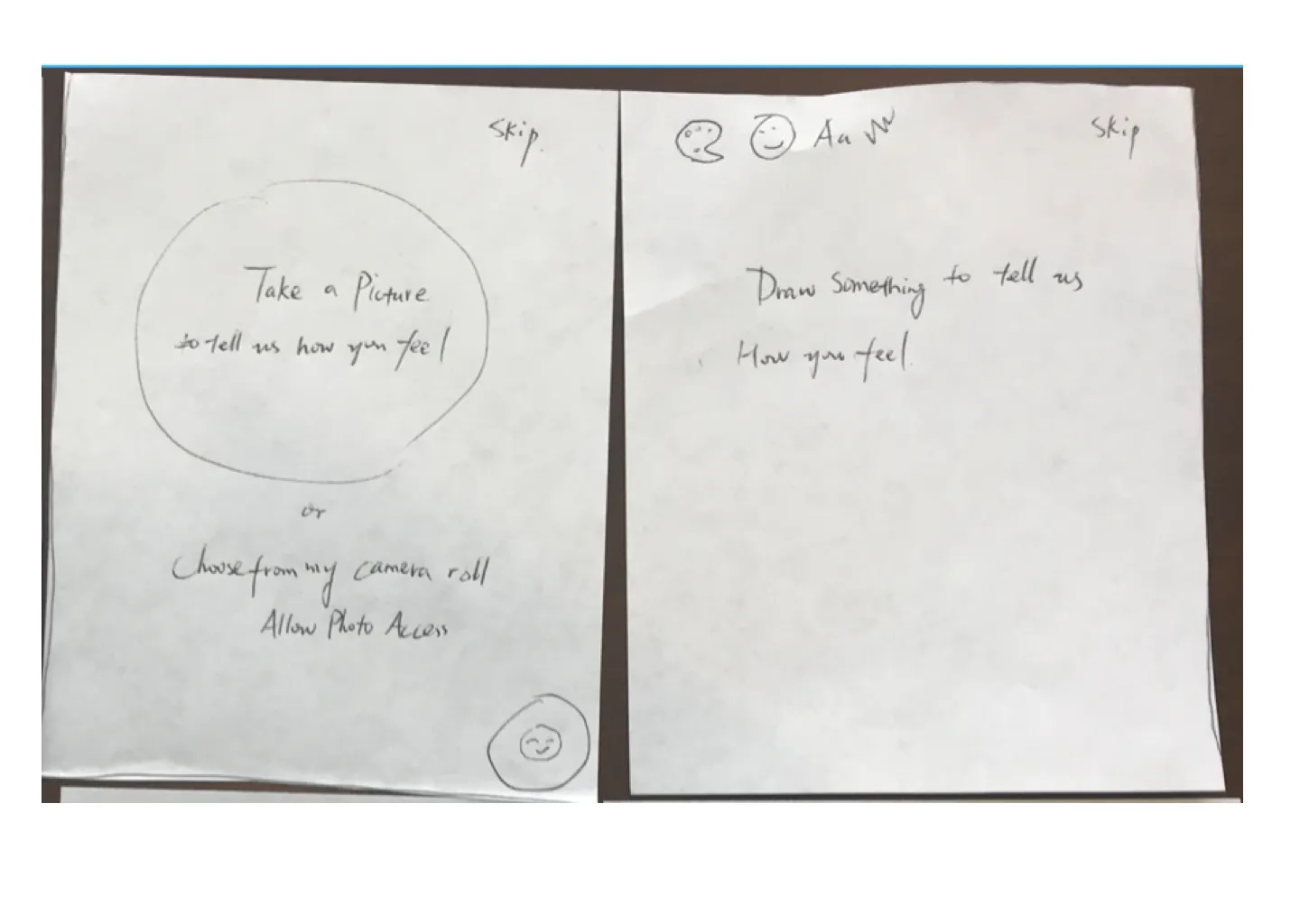
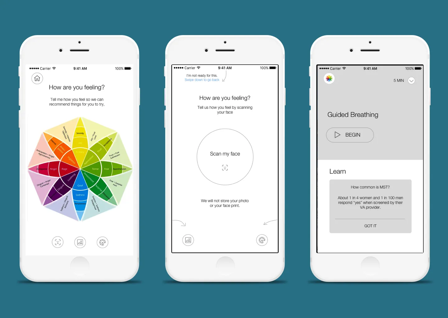
- Emotion, a concept focus on different modes of emotion capture and tailored content recommendation.
- A concept leveraging emerging technologies to provide a personalized therapeutic experience.
- Recommend content based on users’ in the moment emotion or biometrics.
- Emotion wheel
- Face scan
- Free form sketch
- Select a picture
- Heart rate
- Provide curated content that user can start engaging with immediately.
- Switch between recommendation mode and explore mode.
Capture Momentary Emotion
Second Iteration
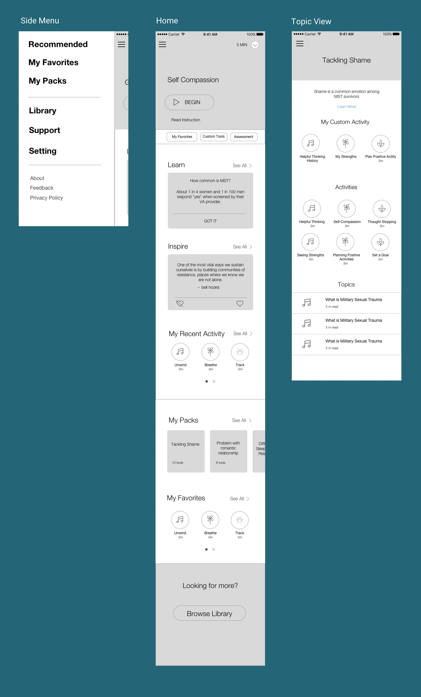
After presenting our clients with these three concepts. We got some feedback from our clients. Summary of feedback would be: these concepts are too radical for VA, we need some sort of middle ground. For detailed discussion around why our approach is too radical,read this post. They did like many elements of the emotion concept. So we developed a relatively more conventional approach around the emotion concept.
Burger Menu Navigation
The Challenge : Content first or Structure first?
At the beginning of the project, we were told by the clients they are still in the process of developing content. We can start thinking about the structure of the app base on the PTSD App they developed in 2015, because as we were told, many content will be similar.
We did the initial concept exploration based on the assumption that MST survivors will have the same kind of need as people suffered from PTSD, meaning they need immediate interactive activity (like guided breathing) or inspirational quotes to either calm them down or reduce their distress level. We will recommend content based on their immediate need (such as mood in general, distress level in particular). We also know that MST survivor may have very different need from people with combat induced PTSD.
But as we start making design decisions on onboarding, global navigation and home page layout, we found it essentially impossible to make informed decision because we don’t know what the content looks like. In our clients’ mind, as long as we build a house, they can then fit in whatever content they have. But we as information architect and designers also need to know who will be living in the house, how many children do they have, what’s their lifestyle, etc., to build a house that actually fit their need.
We are trying to optimize the user experience based on the specific content. What we don’t want to do is to build a generic structure that can accommodate any kind of content and ignore all the dynamics that might happen between the users and the app.
The tricky thing happened when clients finally sent the one sample “content bucket”. Based on the sample content bucket, which was named “Tackling Shame”, we can tell the treatment approach is to help MST survivors identify negative thoughts and develop a positive way of thinking like self compassion, seeing one’s strengths, planning positive activities, etc. None of these seem to be immediate reaction to any sudden negative emotions. They are designed for people in relatively calm mood and be able to think reflectively and critically.
Third Iteration
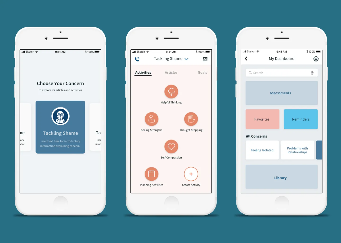
With the new understanding from the sample content bucket and the data we extracted from an a research VA team did in 2015 on the PTSD coach (read the deck I created using the data here). Our design team reflected on our previous approach on navigation and content presentation. We came up with the third iteration of wireframe. It is a hybrid approach which incorporated elements from the second iteration, but used a more dynamic navigational style. Below are summary of the features of this iteration:
- Dynamic navigational style as opposed to the hierarchical navigational style in the PTSD app. It also signifies a departure from the traditional navigational elements such as tab bar and burger menu.
- Adding dimensions to the app structure and thus releasing space for smaller navigational elements as well as dynamic content.
- Emphasizing user’s concern so user can get to content matters most to them quickly without drilling down a hierarchy.
Lessons Learned
This project has its unique challenges right from the beginning. First of all, it has a very unique and specific audience group. Because of privacy concerns, we cannot talk to them directly. Second, our clients also have their own research agenda. The app will be created as a means to collect data for the research on the efficacy of mobile app in treating mental health problems. Sometimes, the need to collect user data upfront may conflict with the sensitivity of respecting user’s anonymity and privacy. Third, there’s disconnect between our team and the VA team on the expectation of content. The VA team expect to see the app structure to finalize their ideas on content. We as designers expect to see all the content to be able to finalize the app structure. We arrived at this ultimate chicken-egg dilemma right before we almost hit the first delivery date. This was promptly resolved by the third iteration we provided, which was enlightened by the sample content buckets and also provided a balanced, flexible and innovative approach. So the lesson here is, always be agile and creative, and ready to deal with ambiguity. And don’t expect to know everything right from the beginning. And most importantly, be humble, because the more you know, the more you’ll know you don’t know.