NITAAC Mobile App
Connect Government Contract Holders with The Right Information
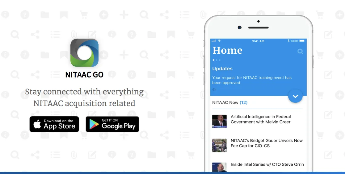
Overview
NITAAC is a government agency under the National Institutes of Health, which specializes in government purchasing and acquisition. I was the lead UX designer for the design of a new app to support NITAAC customers to access various NITAAC services as well as promote more brand engagements.
Project Goal
Create an app that will
- Allow agency customers to access NITAAC services easily
- Showcase NITAAC contract holders
- Raise general awareness and promote more engagement of the NITAAC brand.
My Role
I was the lead UX architect on the team. I also presented initial design concepts to the client and got feedback from them. Together with one other visual designer on the team, we went through discovery, design studio, wireframing and visual design.
Skill/Tool Used
- UX Strategy
- User Research
- Presentation
- Task Analysis
- Stakeholder Interview
- Design Studio Facilitation
- Wireframing
- Visual Design
- Sketch
- Craft
- Invision
Problem Defined
When the project started, we had already redesigned the NITAAC website and were in the process of rebuilding their government purchasing application where products are posted online by NITAAC for their customers to browse and select. With the existing digital assets that NITAAC had at that time, what unique value will this new app bring? With this question in mind, we conducted several rounds of brainstorming sessions with our clients.
After these sessions, we had a better understanding of their business needs and visions. Based on these needs and visions, I developed a requirement matrix to align features and functionalities to user needs and business goals and objectives.
From Business goals and User needs to features and functionalities
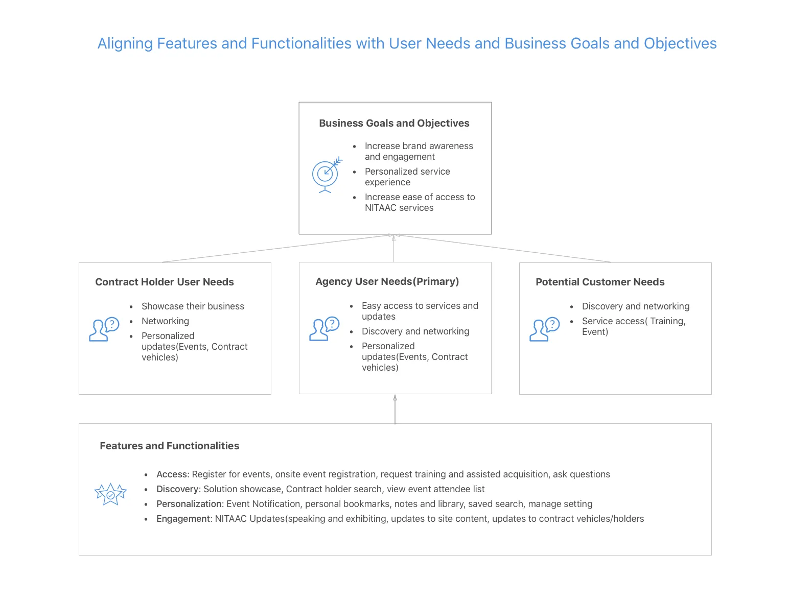
Requirements Matrix
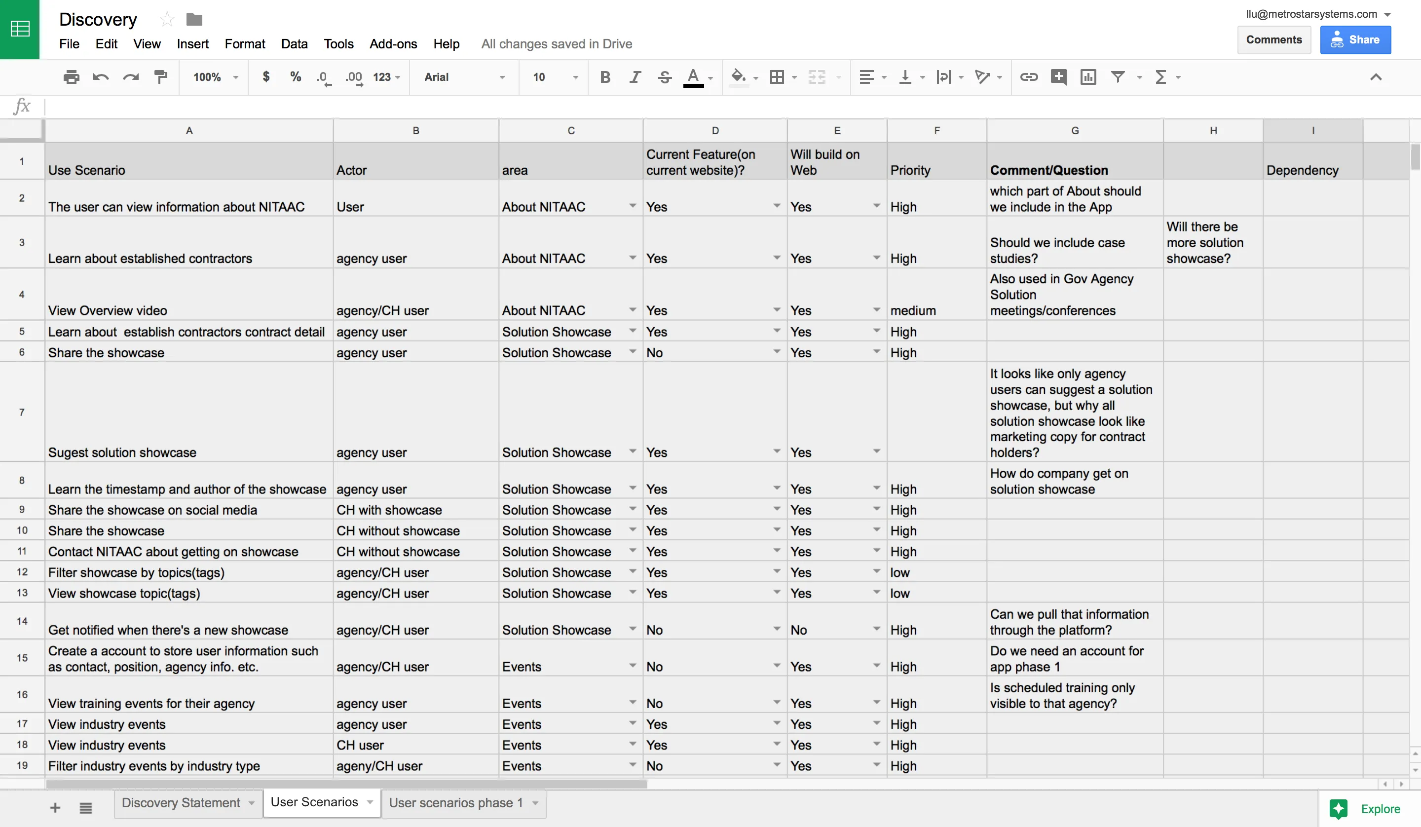
Discovery Documentation
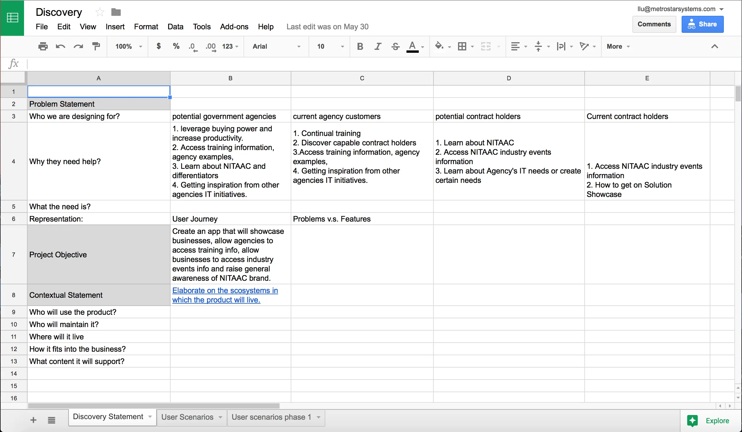
From this project, I also started to use a more systemic approach to design discovery. I adopted the discovery process/framework from Dan Brown, where we create a shared understanding of the project by developing assertions such as problem statement, project objective, business context, technology context, user context and content context. Below is my discovery documentation in process. For a more detailed description of Dan’s process/framework, see his book Practical Design Discovery.
Discovery Documentation in progress
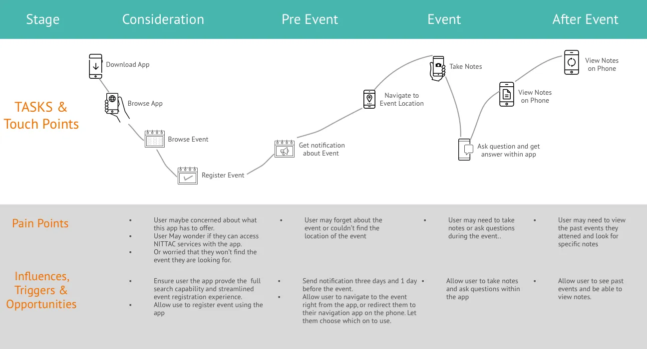
Customer Journey Mapping
Concept Exploration
Outcome
Based on our understanding of the feature priority, we identified the main areas of the app: NITAAC Updates and other Content created by NITAAC, Events and Training, Account and Setting.
Based on this understanding, we started sketching out ideas. Initially, we came up with a standard tab bar based system where different areas of the app can be accessed from the bottom menu (tab bar).
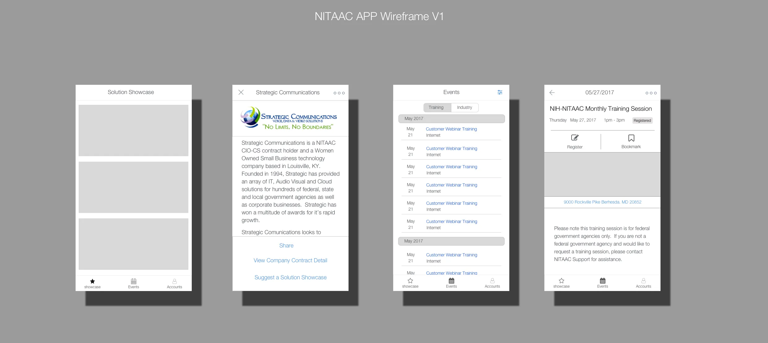
First Iteration of the app
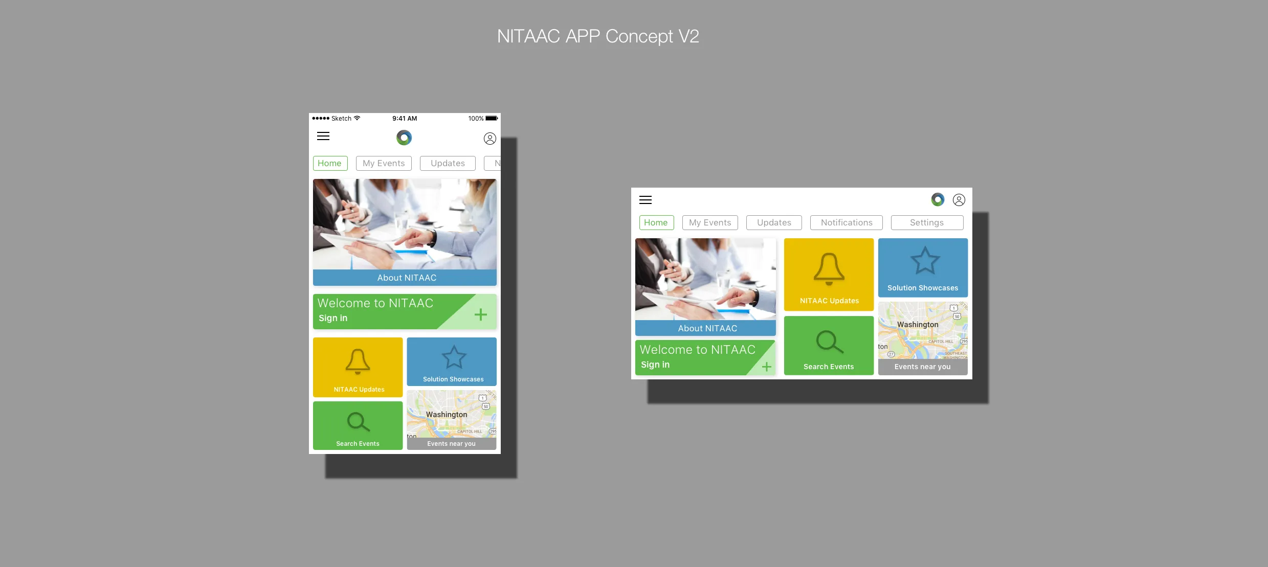
After some internal discussion among team members. We decided to look for a more novel navigational approach to account for more dynamic interactions. To explore this direction further, we did a competitor analysis on comparable apps. Since one of the most important aspects of the App is to allow customers to search and register for events, we looked into major airline companies such as United Airlines and event apps such as Eventbrite.
Second iteration of the app features a tile style design with no tab bar
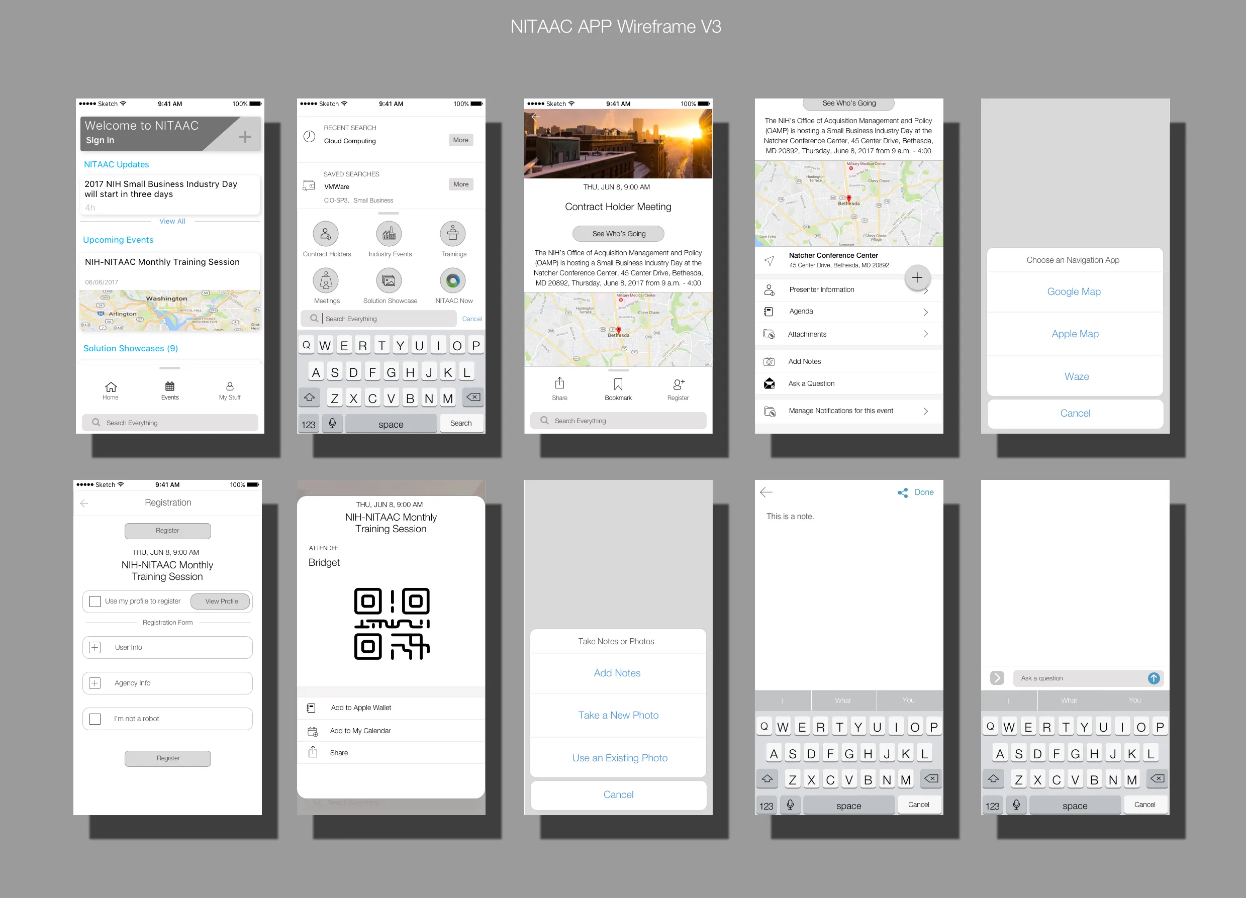
We later envisioned the home screen having a feed of notifications similar to iOS Control Center that can hide and show through a swipe interaction. The home screen should be an ongoing list of information and news for the user. As they personalize the app more it gets more tailored to the industries or companies of their interest.
As for global navigation, I came up with a hide/show global navigation using a modal bottom sheet accessed through swiping from the bottom of the screen similar to iOS Control Center and Apple Maps. The action items on the bottom sheet will change depending on users’ primary tasks on each screen.
Third iteration wireframe
The next iteration we had on global navigation is to access the three main screens of the app through a simple horizontal swipe gesture. This way, we eliminate the need to have a global navigation bar altogether. The structure itself signifies simplicity. We also evolved the single action button on the screen to be the primary action of the page.
Fourth iteration mock up
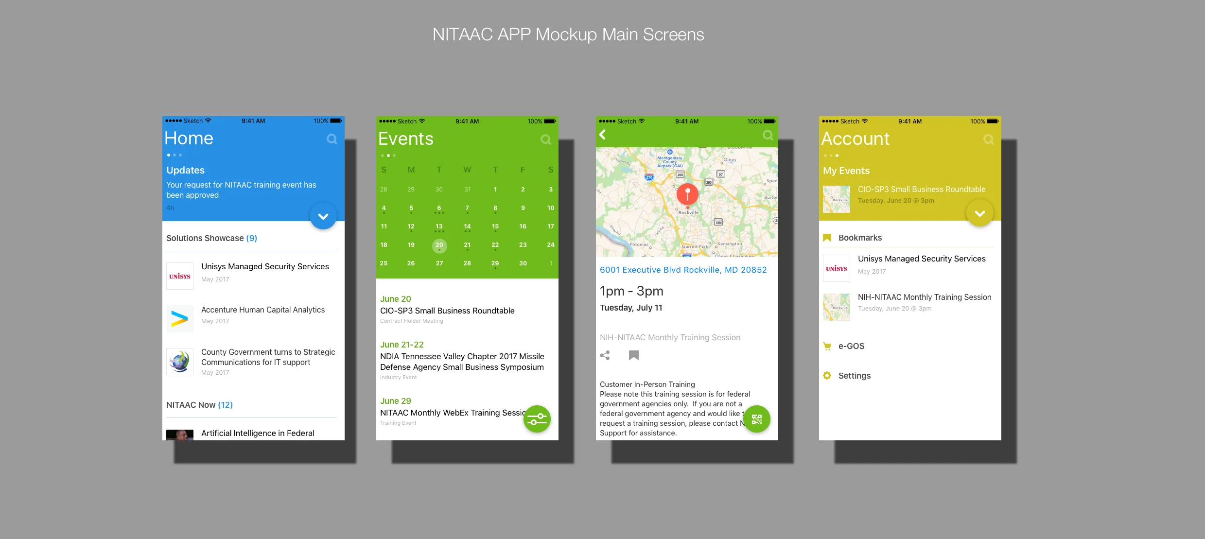
We presented this version to the client as well as the users of the app in the NITAAC contract holder meeting. It was well received and our digital director received a special thank you from our client. I later fleshed out all the app screens with features and functionality and interactions based on this navigational scheme and visual style.
Lessons Learned
There were two main UX challenges I had to tackle when working on this project.
- Define the unique value this app can bring.
In one of the early meetings with the clients, the client struggled to articulate why they need the app. Because of the lack of understanding of the mobile app platform and a clear definition of the position of the app in relation to NITAAC’s existing digital assets, at one point, the clients even said maybe we should scrap the app. I then started to explain and elaborate the “why” to the clients. Any organization should not just build an app simply because we can or every organization has an app. Also, we need to define what features and functionality to prioritize and optimize in mobile app and what to optimize on the mobile web given the limited budget and time. These questions can only be answered by starting out with business objectives and user needs. After we went through business priorities and government agency and contract holder users’ needs with clients, we collectively defined the main features and functionality that we can easily bring to life in the mobile app by leveraging current NITAAC website and the huge government purchasing systems e-GOS behind NITAAC.
- Navigational style matters
Since this app has many dynamic components and interactions such as calendar, event registration, etc. The traditional navigational scheme with tab bar and the “burger menu” seem to be quite limiting. The tab bar will take a lot of space on tablet horizontal view; what’s under the burger menu usually gets ignored because “what you see is what you use”.
For global navigation, we evolved from action sheets to single action button to the final version, the swipe gesture based navigation. This navigational scheme makes sense here because this app only has three main areas and people already are accustomed to swiping thanks to the iOS widgets (swipe left from home screen to access). It reduced navigational elements to the minimum (three dots) and thus allows for more screen real estate for dynamic content. If there are more than three main content areas, this navigational scheme won’t make sense because the swiping would take more effort to get through all levels of content and users may feel disoriented.
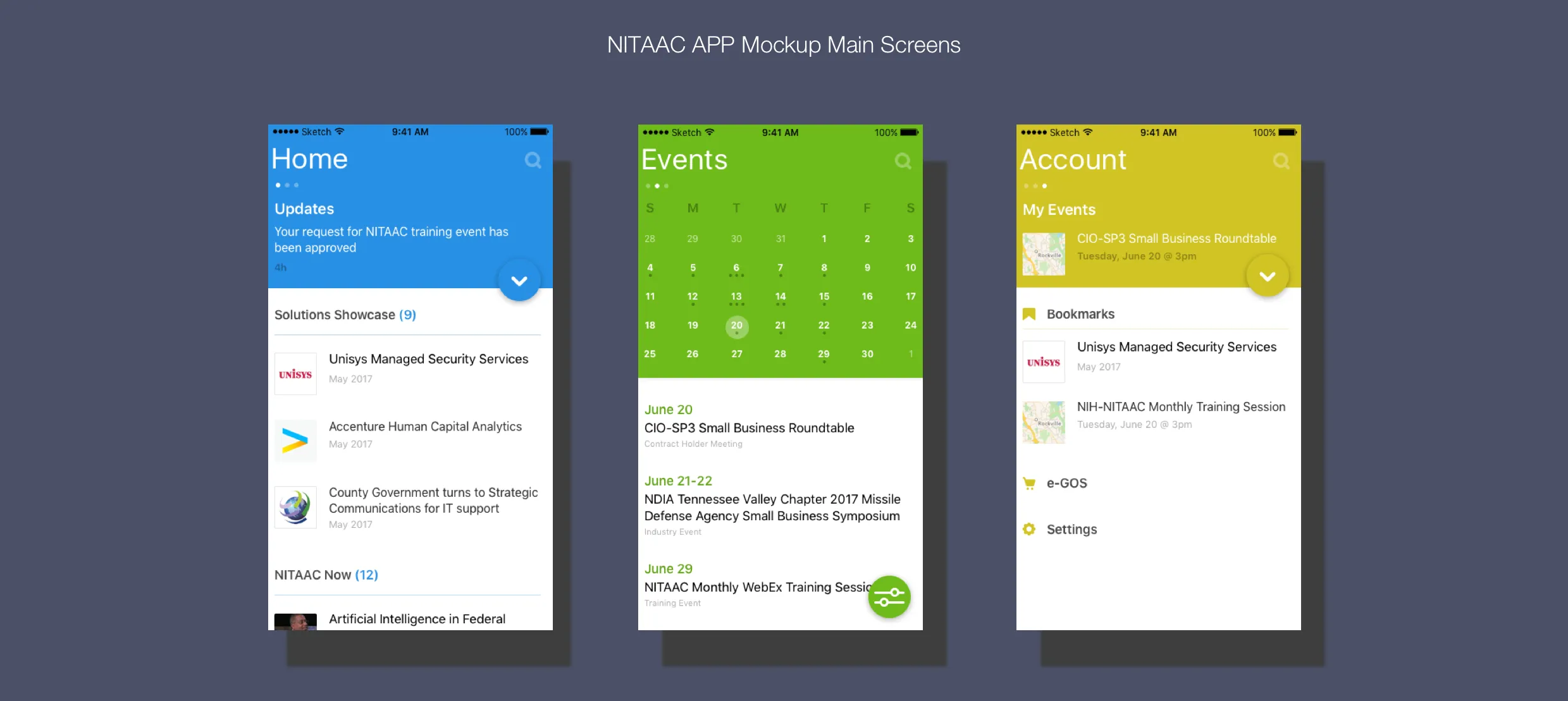
In order to hit this sweet spot of just enough navigational elements, we painstakingly iterated through 4 complete design cycles. This project is definitely a hard-won result, well worth the effort. It sheds light on how to create novel app architecture based on content and user context. It also signifies endless possibilities of innovative app architecture.