How we build the Gainful Employment Reporting Solution
Leading Design Team Through Unusual Times
Overview
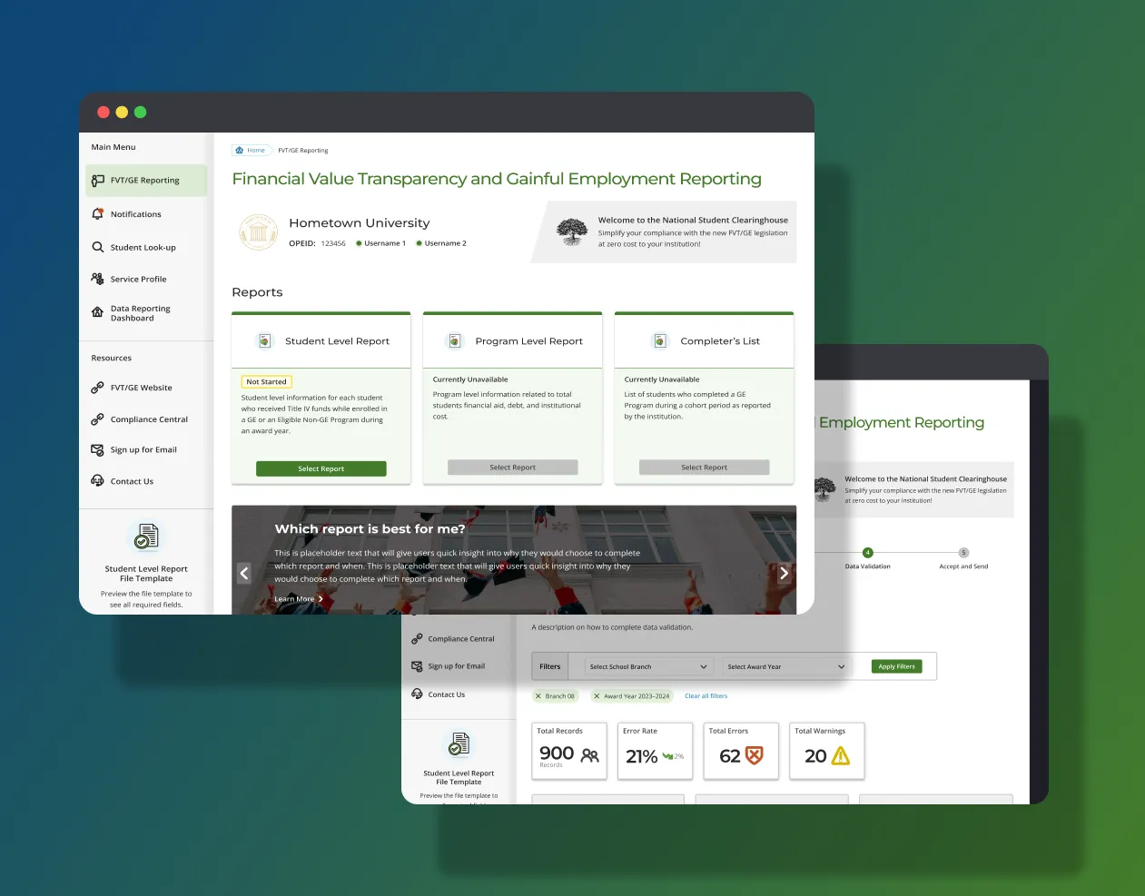
The National Student Clearinghouse serves more than 97% of all US higher education institutions by reporting their Enrollment data to the Department of Education. The new Department of Education regulations will go into effect on July 1, 2024, and all higher education institutions must submit their first Gainful Employment reports to the Department of Education no later than October 1, 2024. Non-compliance risks for schools include losing access to federal student aid and having to provide specific warnings and acknowledgements for students before signing enrollment agreements with prospective students.
As the senior manager of user and customer experience, I was brought in to lead this high-visibility and high-pressure effort to design this completely new solution that will serve the majority of our school customers in several months’ time. A UX designer and two business analysts executed the day to day work under my guidance. This case study is a glimpse into how I led my teams towards positive outcomes.
Advocating for User Research on a Strategic Level
Project Goal and Challenges
My team’s starting objective:
- Create a reporting solution for Financial Value Transparency/Gainful Employment (FVT/GE) for schools that is flexible, intuitive and intelligent enough to foresee the users’ needs.
- Highlight our benefits to users: Ease administrative burden, Reduce data processing turnaround times, Increase data accuracy.
Challenges we are facing
- Complex reporting processes
- Incomplete, evolving reporting requirements
- Lack of user inputs at the early stages of design
My Role
My primary role was to define the initial roadmap with product management and engineering, guide the UX team with feedback, staff the effort with the right amount of UX support, include user research properly, align the team’s goals with key stakeholders, integrate the UX team efforts with those of cross-functional partners’, and ensure the GE reporting solution evolved to help schools navigate the new reporting challenges and lay the foundation for a system that can easily adapt to meet future reporting needs. In short, to set the team up for success in this design-led effort.
Skill/Tool Used
- Design leadership
- Stakeholder Alignment
- Project management
- Prioritization
- Wireframing
- Interaction Design
- Information Design
- Visual Design
- Design System Development
The UX team’s cross-functional partners in product and engineering wanted to move quickly with the assumption that they didn’t have the time for user research. Yet, I consulted with the Executive Director of the GE product. I strongly advocated conducting user research since this new reporting product is for a completely new customer segment: the financial aid directors. It will be instrumental for us to understand their perspectives from a strategic level so our product roadmap is set up to meet their current and future needs.
A customer advisory council was formed to have bi-weekly check-ins with prospective school customers to ensure the design meets their expectations and incorporates their feedback. I also ensured that we followed the right product development process, from the get go, by bringing in prospective users to conduct quick user research for every major feature design, to finally set us on the right path.
Content Strategy
Content Strategy
The complex nature of the new reporting requirements made Content Strategy an important part of the UX design. While we do not want the UI to have overly long explanatory copy, we still need to educate our users with the right amount of information in the right context since this is a completely new reporting solution for a completely new reporting requirement.
The UX team collaborated with product team and content team and factored in the institutional goals, our unique position in the reporting process, user state and come up with the following content strategy.
- Educate at the right moment
- Visualize the process as much as possible.
- Comprehensive User Guide only as the last resort
First Challenge
“How might we balance flexibility and simplicity?”
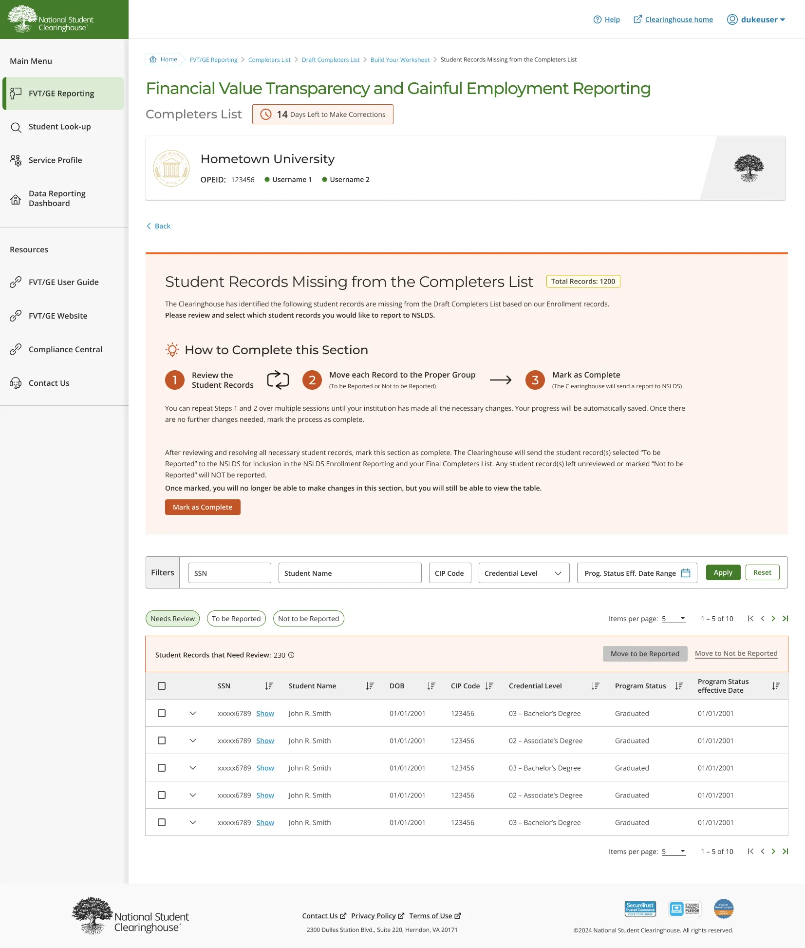
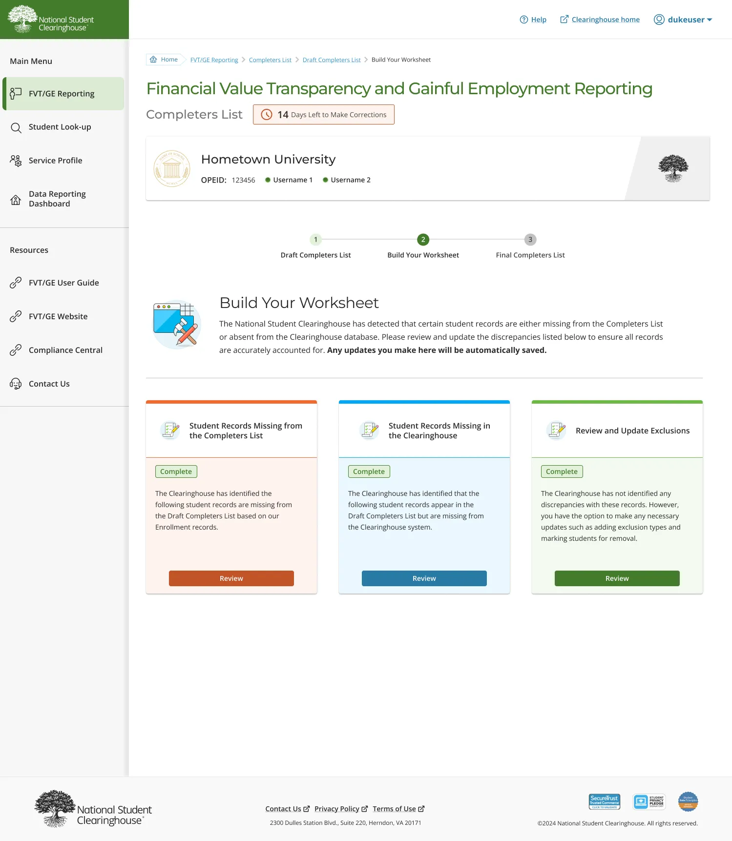
As we started approaching design for the first part of the reporting solution - Cohort Identification. We found we were faced with conflicting design goals.
Flexibility is one of the design objectives. Our solution needs to provide flexible ways for schools to identify the students who are required to be reported. They should be able to do it in batches, or drill down individually to investigate the details. We also allow more than one user to access the system and work on the report simultaneously and that adds yet another layer of complexity. From the Data Collection part of the puzzle, we also need to provide many different ways for data updates, including file format and different cohort year combination. The emphasis on flexibility introduced more complexity in system design and we need to somehow let the user know they have all the options without making the system appear to be overly complicated. Also, because of all the flexibility we are trying to incorporate, there’s no stringent way to do certain things. We discovered in the user testing many users were confused about how they should do certain things and worried if they are not doing it the right way.
Solutions Design Principles
After some trial and error and rounds of usability testing. We established the following design principles that were proven to address this issue.
- Use familiar patterns throughout
- Provide bite-sized guidance in context
- Thoughtful complexity that reflects the truth about the system
Second Challenge
“How might we guide users through new reporting requirements that they are not familiar with and make them feel they are supported and in control?”
Solution1:
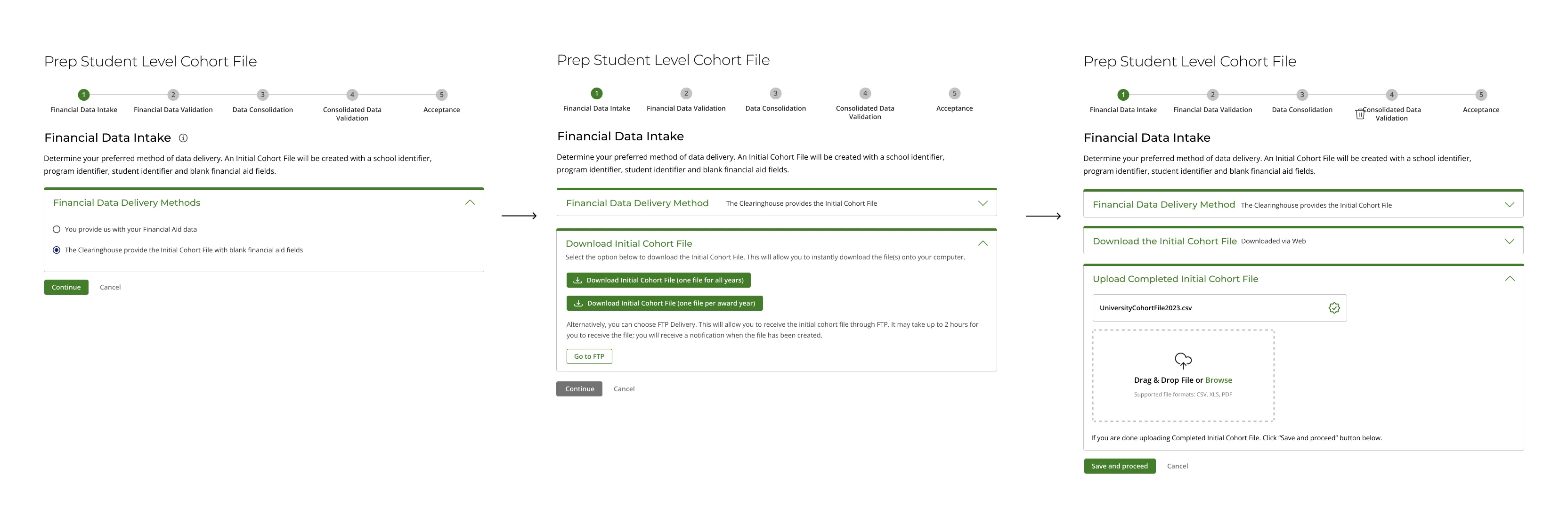
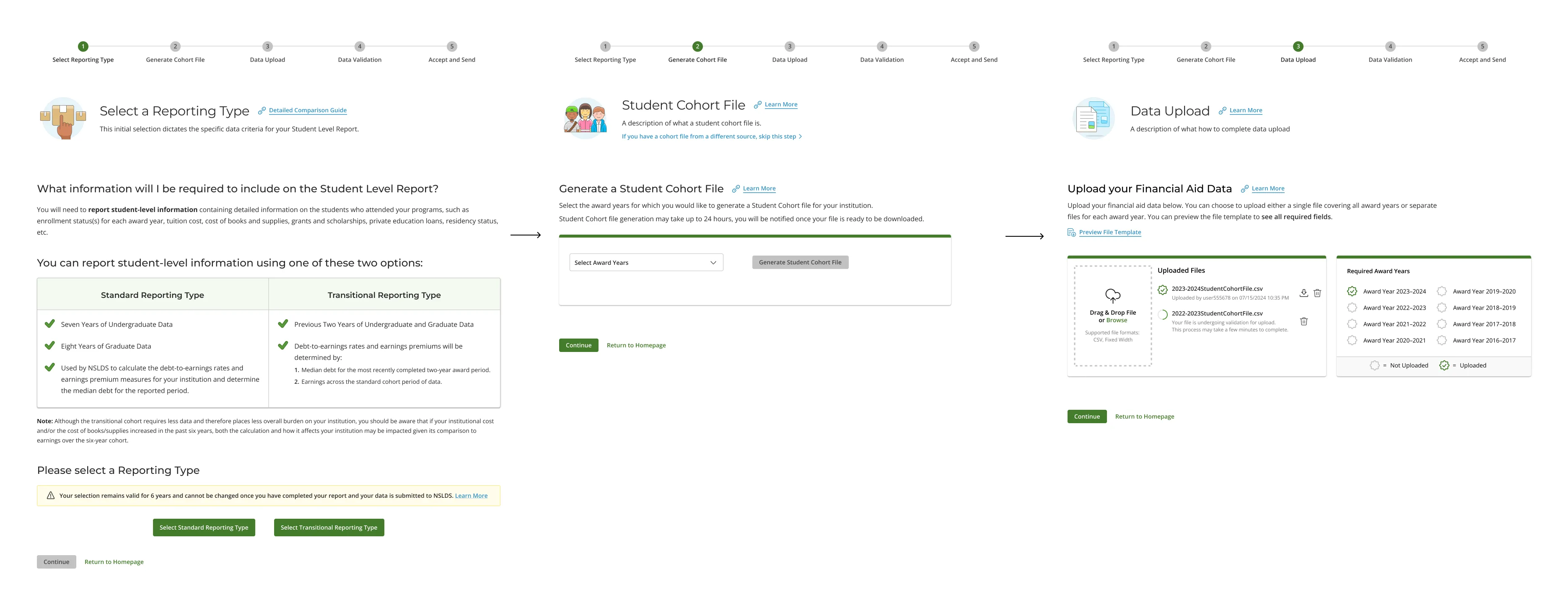
Step by step, have the user select an option
When we designed the first draft of our solution, we decided to have a horizontal stepper that shows each distinct phase the user goes through. Under each step, we progressively show additional substeps through accordions.
Solution 2: Streamlined process and simplified individual steps
Streamline overall data validation process, separate data upload process into discrete steps, thus simplify each step.
As we went through users’ journeys, we modified the data validation process to make it more streamlined, so the stepper has been reduced to fewer steps and we present the data upload, file generation process as discrete steps instead of substeps. This made the process easier for the user to grasp and removed the extra layer of complexity of substeps.
Third Challenge
“How might we present data validation results and guide users through error correction, which could be a tedious process?”
Solutions
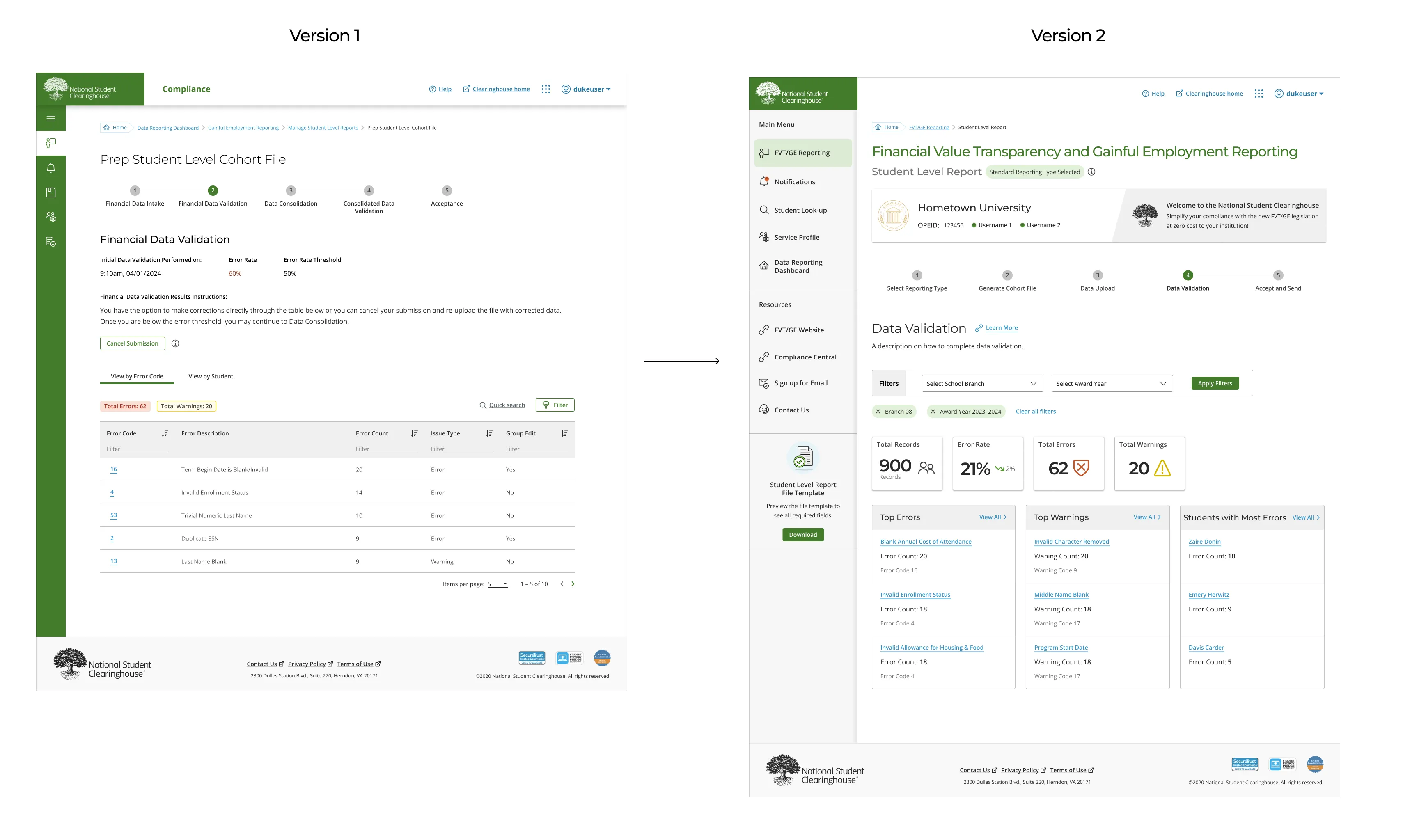
Originally, we summarized errors from data validation as a table, and users click through those errors to correct them. there’s nothing wrong with the approach, but user lacks insights into the data quality in general and the tasks make people feel like they are laborious and never ending.
In our second iteration, we landed users on a dashboard with relevant metrics so they get an overview of the data they are submitting, including error rate, total errors, total warnings and top errors, top warnings and students with the most errors. User can then approach the error correction task with more flexibility without resorting to search and filter first.
Fourth Challenge
“How might we balance the consistency principle of design system yet adapt to changing user needs?”
The battle of navigation menu
We received feedback from the product team and customers that customers would like to have the left navigation always open. This brings us to the fourth challenge.
The current behavior of the left navigation of all our applications is collapsed to show only icons by default. The reason for that decision is because many of our products center around data and data visualization, which will need to use as much screen real estate as possible. Should we change menu behavior for this single product? How should design system adapt?
Results
We redesigned the left menu, which is contextual to the new GE reporting application. It includes a new notification center, links to important resources that are provided by the Clearinghouse, as well as the official FVT/GE site (external). The new left menu will stay open throughout the application.
The visual design decision for the new left navigation centers around making it less of a center of attention now that it is part of the page. So instead of keeping it green, which is what the left menu originally looked like, we changed it to white in the first draft. We updated the design later to make it a light gray with subtle drop shadow so the menu doesn’t overshadow the main content area, making the main page stand out more.
Outcome
This is a developing case study as we work through the three reporting types. Stakeholder alignment is a big challenge throughout the project so far because of the tight deadline, incomplete and changing requirements and evolving customer feedback. The design team also adapted to the changes and became truly agile and flexible in adjusting design direction and solution to meet the changing reporting requirements and customer feedback.
The first two of the three reports required by GE are now under development and are scheduled to launch before July 22nd, 2024.
The project was under a lot of executive and stakeholder pressure for several months straight, which caused some burnout on the team. I was able to help manage the stress levels of the team by collaborating with cross-functional stakeholders to re-calibrate expectations, and ensured 100% retention of our UX team members.
The project happens at a pivotal moment at my organization. We were able to accomplish more with less. Constraints breed resourcefulness, self-sufficiency and invention. There’s something about this kind of high-pressure, high-stakes project that keeps our creative and critical thinking muscles strong.
Prioritize features to ensure delivery of utmost value in the shortest amount of time:
As time is quickly approaching planned delivery date when the NSLDS (National Student Loan Data System) releases the financial data to the schools. Our solution needs to be ready by a July date. As the development team worked through their challenges, the whole team recognized that we need to trim down features for first release.
I worked closely with product team and technical team on feature prioritization. We weighted technical feasibility, impact on user experience and solution integrity to determine the final list of features we will deliver in release 1.