Designing a Verifiable AI Health Experience
A shared source of truth between a person and an AI assistant
Project Background
I built a personal system that brings together health data from a smart ring, Apple Watch via Apple Health, and manual entries such as weight and menstrual-cycle dates. An AI assistant reads the same data and uses it in daily conversations about sleep, recovery, and activity.
The system had data, but no shared interface. I could inspect raw values and the assistant could retrieve database records, yet neither of us had a clear artifact to reference when a number was missing, outdated, or contradicted by another source.
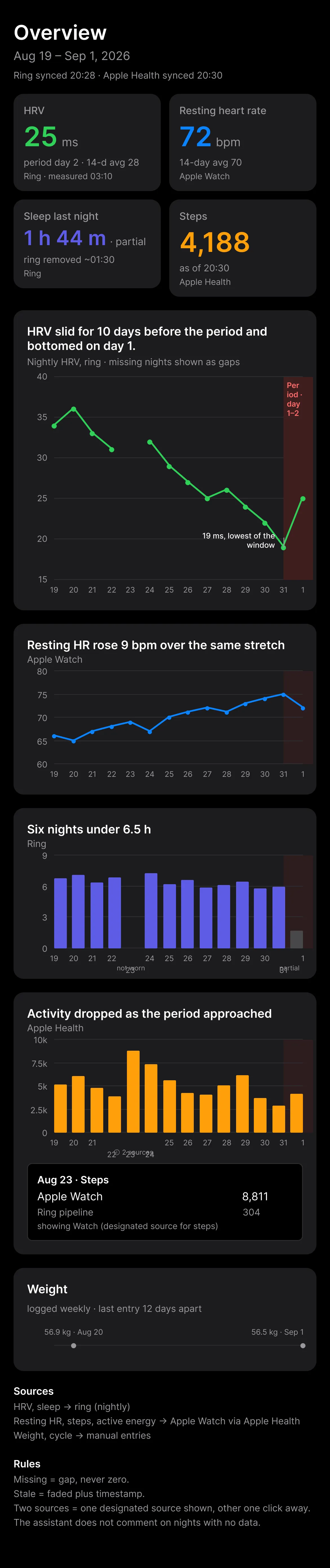
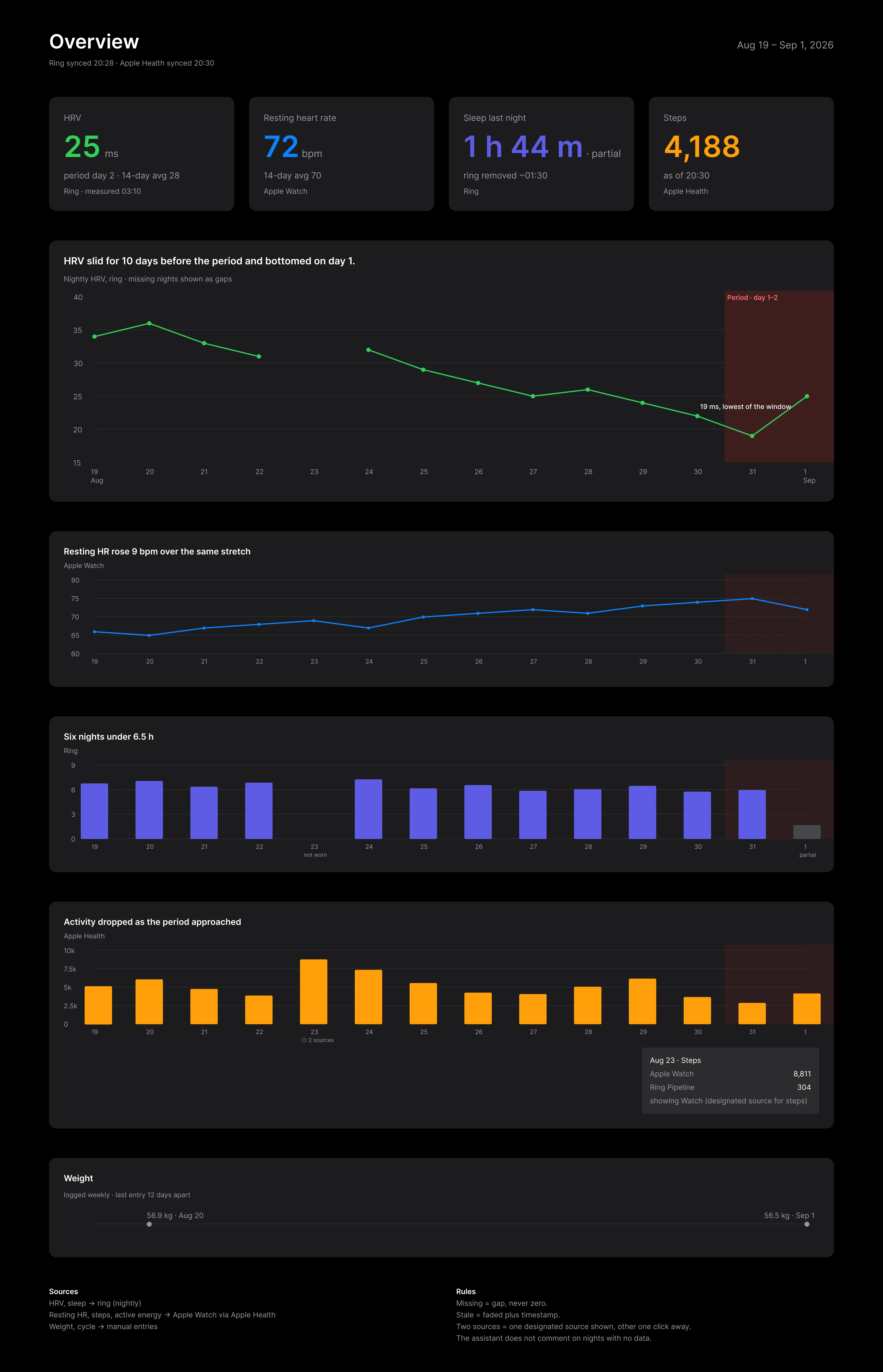
I designed Health Overview as that shared reference: a dashboard that helps me understand how I’m doing while giving the assistant enough context to avoid overstating what the data can support. The final deliverable is three screens that share one dataset and one visual grammar: a desktop dashboard, a mobile view, and a conversation screen where the assistant answers questions with cited evidence.
This was a portfolio prototype, built with a fixed 14-day illustrative dataset modeled on real failure cases in my system. The goal was to demonstrate data-visualization judgment and visual craft—not to build a production health platform.
My Role: Product Designer Scope: Product framing, data visualization, visual design, responsive layout, conversational UX, AI-assisted prototyping
Tools: Figma Agent, Figma Make, Claude via Figma MCP
Timeframe: Design exploration, September 2026
Problem Statement
How might a health dashboard explain what is happening in the body while remaining honest about incomplete, outdated, and conflicting data?
Multi-device health data creates a deceptively simple design problem. A polished chart can still tell the wrong story:
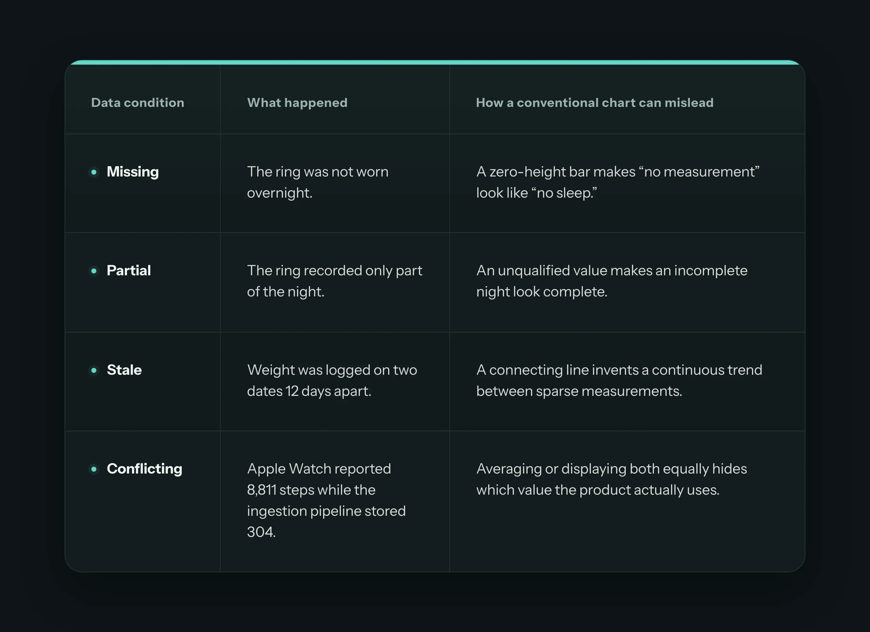
My first instinct was to foreground these data-quality states. That quickly turned the experience into an observability console: useful for debugging the pipeline, but poor at answering the user’s actual question—“How has my body been, and what should I know today?”
I reframed the dashboard around two readers:
-
Primary reader — the user: understand recent changes and today’s context.
-
Secondary reader — the AI assistant: understand which evidence is safe to reference and where the limits are.
The design challenge became one of hierarchy: keep the health story prominent, while making data limitations visible exactly where they change the meaning.
Design Principles
- Lead with a claim, then show the evidence
Instead of a topic title such as “HRV,” the hero chart states the intended reading: “HRV slid for 10 days before the period and bottomed on day 1.”The annotated low point and menstrual-cycle band let the reader verify that statement directly.
The claim is deliberately scoped to this 14-day sample. It describes the displayed window; it does not claim a recurring causal relationship.
- Match each chart to the comparison task
I chose each form according to what the reader needed to compare:
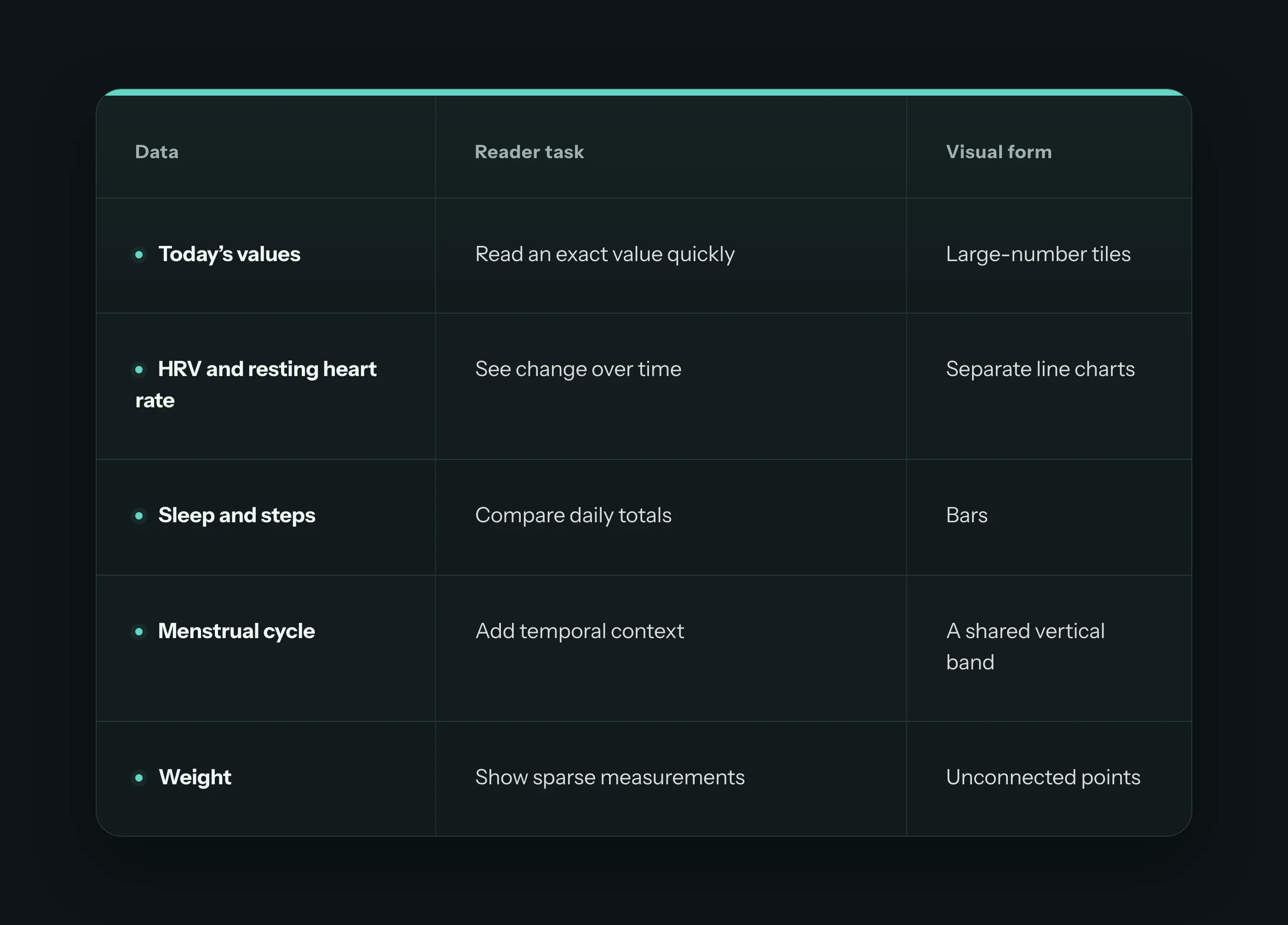
The charts use aligned dates but retain separate scales. This makes events across the same period easy to compare without using a dual axis or implying a relationship that the data cannot establish.
- Make missingness part of the visual grammar
Data limitations are rendered as states of the existing marks, not as a separate warning system:
- Missing data becomes whitespace, never zero.
- Partial data keeps its value but receives a direct “partial” label.
- Stale measurements use reduced opacity and an explicit date.
- Conflicting values show the designated source in the chart, with the alternative available in a provenance card.
This keeps the interface calm while preventing absence from being mistaken for a physiological event.
- Use attention deliberately
The layout establishes four levels of hierarchy:
-
the takeaway;
-
the HRV evidence supporting it;
-
resting heart rate, sleep, and activity as context;
-
source and freshness details as metadata.
The first light-theme exploration used one accent and neutral supporting charts. It was clear but felt too much like a report. The dark-theme exploration introduced stronger metric identities and more visual energy, but initially gave every series equal saturation.
The final color pass preserves distinct metric hues while grading their intensity: HRV receives the strongest chroma; resting heart rate, sleep, and steps remain recognizable but subordinate. Missing, partial, and stale states rely on labels, gaps, and opacity—not hue alone.
- Show provenance without turning the dashboard into a debugger
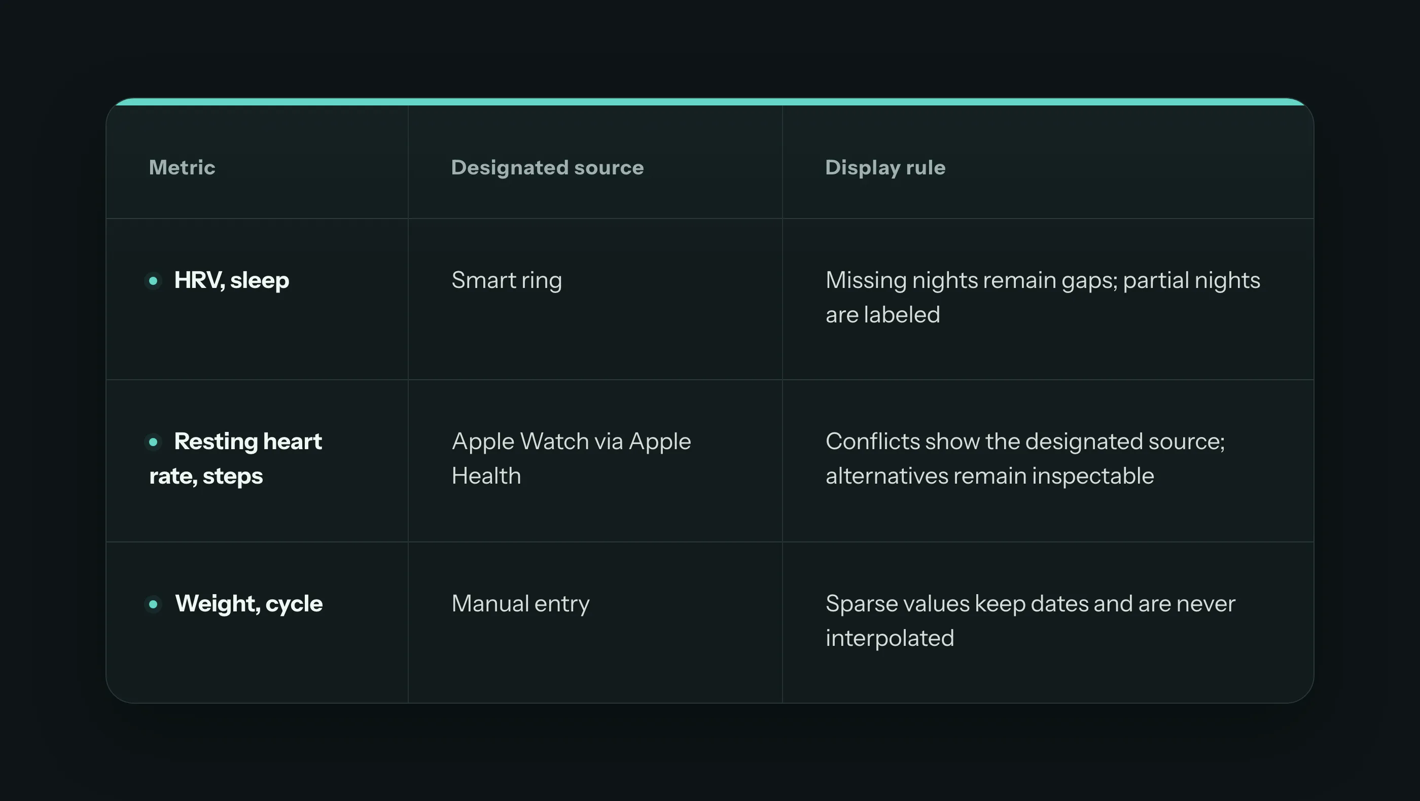
Every summary value includes a source or measurement time. Detailed provenance stays quiet until it matters. The Aug 23 step conflict is the only expanded example on the page: the chart shows the designated Apple Watch value, while a small card exposes the pipeline value and the rule used to resolve the conflict.
This preserves the user-facing narrative while making the product’s decision traceable.
- Give the AI explicit boundaries
The footer turns the visual grammar into speaking rules: “Missing = gap, never zero,” “Stale = faded plus timestamp,” “Two sources = one designated source shown, other one click away,” and “The assistant does not comment on nights with no data.”
That connection is central to the concept. Trust does not come from adding a vague confidence score. It comes from showing the evidence, naming its limits, and preventing the assistant from making a stronger claim than the interface supports. The conversation screen, described below, is where these rules stop being footer text and become observable behavior.
The Conversation
Where the second reader becomes visible
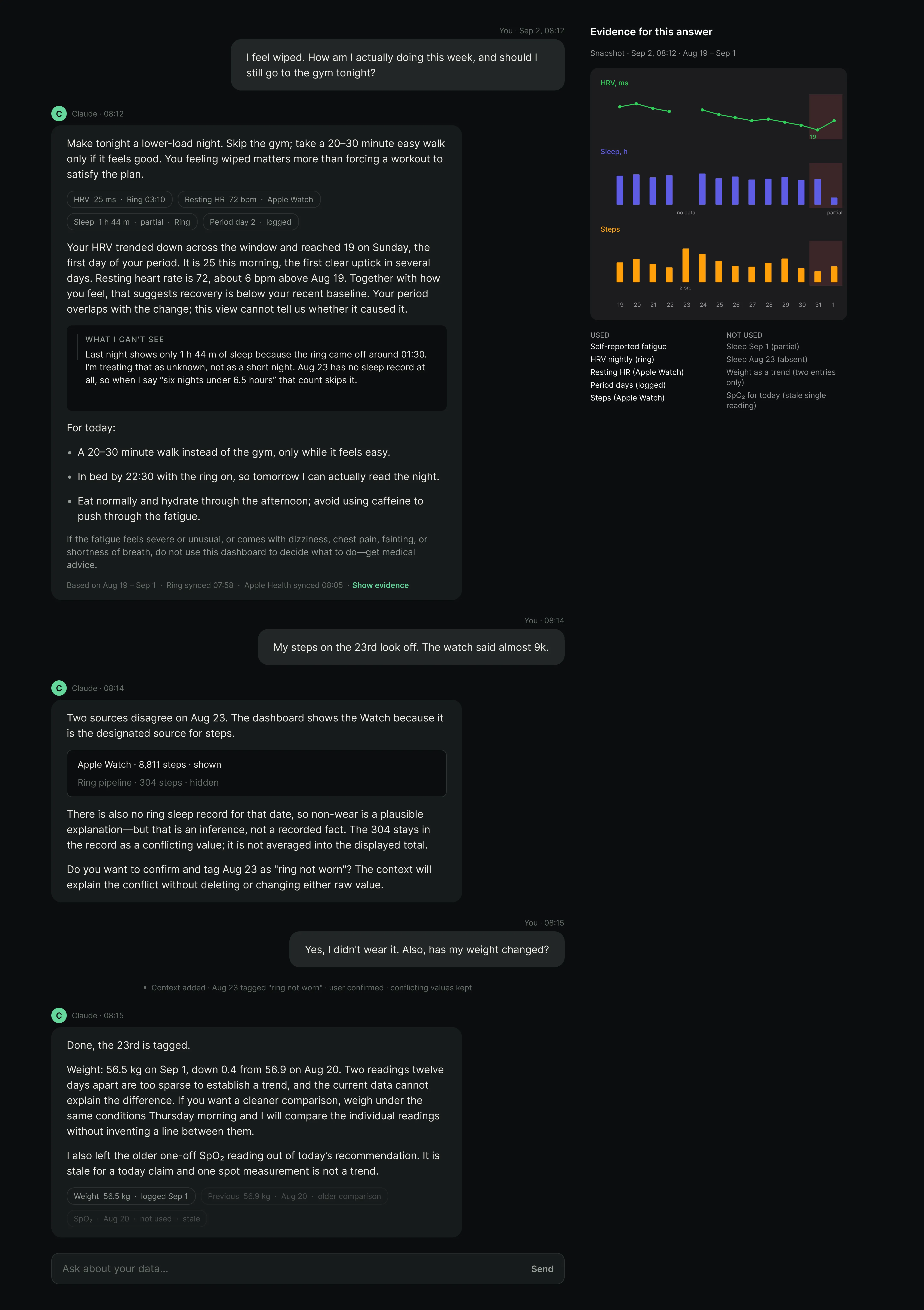
The dashboard promises that the assistant will respect the data’s limits. The conversation screen is where that promise is kept in front of the user. I designed it around a real exchange seeded with the same 14-day dataset.
Anatomy of an answer. The user asks: “I feel wiped. How am I actually doing this week, and should I still go to the gym tonight?” I structured the assistant’s reply in a deliberate sequence:
-
Recommendation first, in plain language: make tonight a lower-load night.
-
Evidence chips, directly beneath the recommendation: “HRV 25 ms · Ring 03:10,” “Resting HR 72 bpm · Apple Watch,” “Sleep 1 h 44 m · partial · Ring,” and “Period day 2 · logged.” Each chip compresses a dashboard tile into speech: value, source, and freshness.
-
A scoped interpretation: HRV trended down and bottomed at 19 on day 1 of the period; the period overlaps with the change, and “this view cannot tell us whether it caused it.” The claim boundary from the hero chart, restated conversationally.
-
A “What I can’t see” callout. The assistant names its own blind spots: last night shows 1 h 44 m only because the ring came off around 01:30, so it is treated as unknown rather than as a short night; Aug 23 has no record at all, so the “six nights under 6.5 hours” count skips it. This is the missing/partial grammar translated into language, absence acknowledged instead of silently excluded.
-
Concrete actions, then a safety boundary: if the fatigue is severe or unusual, or comes with dizziness or chest pain, do not use this dashboard to decide, get medical advice.
The evidence panel.
Beside the thread, an “Evidence for this answer” rail pins the exact snapshot the answer was computed from, with its own timestamp. Miniature HRV, sleep, and steps charts reuse the dashboard grammar, including the gaps and the cycle band, so the user can see the same shapes the assistant is describing. Below them, two lists make the reasoning auditable: “used” (self-reported fatigue, nightly HRV from the ring, resting HR from the Watch, logged period days, Watch steps) and “not used”, with reasons (the partial Sep 1 night, the absent Aug 23 night, weight as a trend with only two entries, a stale single SpO₂ reading). The two-reader contract from the problem statement becomes a literal checklist.
Repairing a conflict without destroying data.
The second turn exercises the Aug 23 step conflict. The user notices the 23rd looks off; the assistant shows both values in a card (Apple Watch 8,811 shown, ring pipeline 304 hidden), states the designated-source rule, and is careful about epistemics: no ring sleep record makes non-wear a plausible explanation, “but that is an inference, not a recorded fact.” It then asks for confirmation before tagging the day “ring not worn.” The system event line records the outcome: context added, user confirmed, conflicting values kept. Data gets annotated, never overwritten, and the user is the one who confirms the annotation.
Refusing to invent a trend.
whether her weight has changed, the assistant gives the two readings with dates, and declines to call two points twelve days apart a trend. Instead it offers a protocol: weigh under the same conditions Thursday morning, and it will compare individual readings “without inventing a line between them.” This enforces the unconnected-points rule from the weight chart in conversation. It also volunteers that it left the stale SpO₂ reading out, showing the excluded chip in a grayed state.
Designing this screen changed how I think about AI trust UI. The common pattern is a disclaimer or a confidence score bolted onto a fluent answer. Here, every trust element is specific: chips cite sources, the blind-spot callout names dates, the evidence panel shows what was excluded and why, and destructive-seeming operations route through user confirmation while preserving raw values. The assistant earns trust the same way the dashboard does, by showing its work at the point where it changes the meaning.
Outcome
The result is a set of three coherent sceens sharing one dataset and one grammar:
- a desktop dashboard: four-metric Today summary, annotated HRV hero, aligned supporting charts, shared cycle context, honest treatments for missing, partial, stale, and conflicting data, and source and speaking rules for the AI assistant;
- a mobile view that preserves every claim, annotation, and data-quality state, carrying hierarchy through order instead of width;
- a conversation screen where the assistant answers with cited evidence, names what it cannot see, repairs a data conflict with user confirmation, and refuses to fabricate a trend.
The prototype demonstrates five core capabilities:
- Data-visualization judgment: visual forms are chosen by comparison task, with no dual axes or invented continuity.
- Narrative hierarchy: one clear takeaway leads, while supporting metrics remain available without competing for attention, on both breakpoints.
- Trust through design: provenance, freshness, and missingness appear where they affect interpretation rather than as a generic trust score.
- Conversational AI behavior design: the dashboard’s rules become the assistant’s observable behavior: cited claims, named limits, auditable evidence, non-destructive conflict resolution.
- AI-assisted design direction: a controlled prompt, shared dataset, and ordered acceptance criteria made three generative workflows meaningfully comparable.
Most importantly, the project changed the role of data quality from a backend concern into a visible product behavior. A missing night no longer looks like a bad night; a partial value cannot quietly pose as complete; and when the assistant speaks, the user can check exactly which evidence it used and which it set aside.
Next Steps
- Run the dashboard with several complete cycles before treating the HRV observation as a recurring pattern.
- Add an optional event lane for illness, exercise, alcohol, supplements, and device removal.
- Validate the hierarchy and terminology with users who do not know the underlying data.
- Test whether the evidence panel and “What I can’t see” callout measurably change user trust and comprehension, compared with the same answer presented without them.
Appendix: Source Rules Used in the Prototype
Speaking rules given to the assistant
- Missing = gap, never zero; the assistant does not comment on nights with no data.
- Partial and stale values are named as such, with timestamps, before being interpreted.
- Two sources = the designated source is shown; the alternative stays one click away and is never averaged in.
- Claims are scoped to the displayed window; correlation with the cycle is noted, causation is not asserted.
- Conflicts are resolved by user-confirmed annotation; raw values are kept.